Create First Grid
Convert your elements into a grid by using the CSS command display: grid; on it (in this case the container). It makes a grid for everything within its parameters.
BEFORE
AFTER
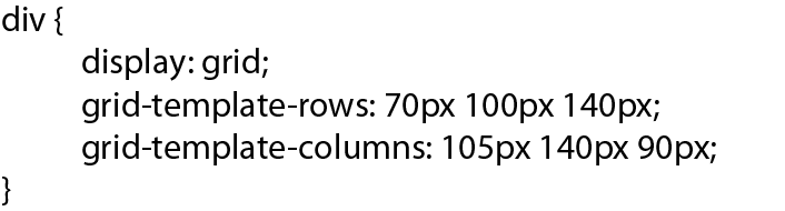
Define structure of Grid
Add columns and rows to your grid by using the properties grid-template-rows: value; and grid-template-columns: value;
div {
				  display: grid;
					grid-template-rows: 70px 100px 140px;
					grid-template-columns: 105px 140px 90px;
					 }
on it (in this case the container). It makes a grid for everything within its parameters.
BEFORE
AFTER
Row(W)
70px
Column(H)
105px
Row(W)
100px
Column(H)
105px
Row(W)
140px
Column(H)
105px
Row(W)
70px
Column(H)
140px
Row(W)
100px
Column(H)
140px
Row(W)
140px
Column(H)
140px
Row(W)
70px
Column(H)
90px
Row(W)
100px
Column(H)
90px
Row(W)
140px
Column(H)
90px
You can use the following set of values to define the lenght and width of each row/column: grid-template-columns: auto 80px 30% 2fr 1fr;
The result:
You can use absolute and relative units like px and em to define the length and width of your columms. Additionally, you can use units fr %
auto
fr sets the row or column to a fraction of the available space
auto automatically sets the row or column to the width or height of of the content.
% adjusts the row or column to the percent width of its container.
Adding Gaps to rows and columns
Add gaps between your row and column boxes by using the properties grid-row-gap: value; and grid-column-gap: value;
BEFORE
AFTER
row gap = 10px